
It’s time for a new beginning and a fresh interior paint job, come check out our colour combination guide and get revived for 2022! We look forward to and hope for a brighter future to outshine the last few years.
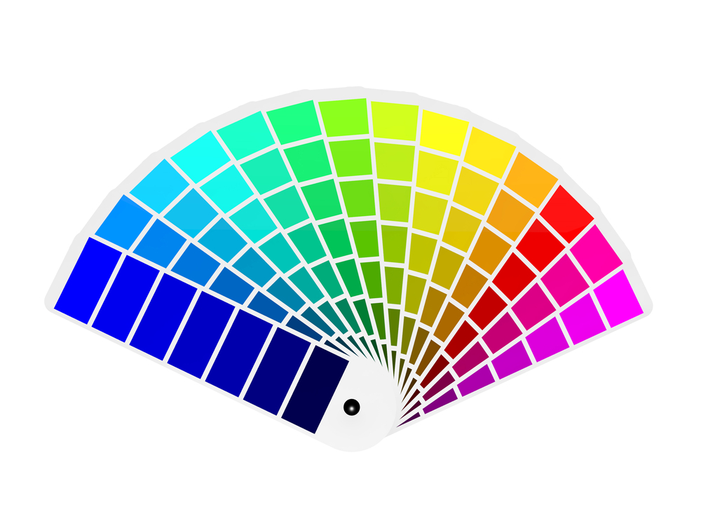
New colour palette forecast trends that have been predicted by the experts at Dulux show both deep and moderate tones. Creating a more relaxing atmosphere, set to revive for the new year. Dulux also has colour choices for those that want to come into 2022, poised and confident, taking advantage of bold and bright colours.
Using Dulux’s stylish new palettes as a base, this article will help you choose a colour scheme for your home, ready to restore, revive and bring wonder into your life.
Restore Palette – Rejuvenate and restore 260
To begin with, we’ll start on the Restore palette, as most will agree we all need a complete detox after the events of the last few years. Here we will recommend some great interior colour combinations out of the palette.
This palette is designed to allow a sense of calmness, and bring freshness into your life evoking themes of nature and restoration, by using neutral tones that benefit from being lit by natural light. Restore has an array of secondary colours that act as a contrast to one another, that doesn’t feel harsh or garish.
Tranquil Retreat and Finnegan
This combines neutral tones and dark shades granting room for softness and warmth. Finnegan is a dark and deep green that, when used in moderation as a highlight complements the soft grey. Use the dark shade as a feature wall, in a bedroom or perhaps your living room, and the lighter grey throughout the rest of the room. These two colours are sure to complement the interior design of your home. Tranquil Retreat is a soft grey that has notes of warmth within, should be used as the base colour as it is the softer of the two.
Winter Terrace and Natural Flora
The contrast of this palette is deep and methodical, allowing room for someone to enjoy their deep notes. This is a beautiful colour choice that would look perfect in a living room, giving it a rich sense of serenity. Winter terrace is a grey-beige, also known as greig that has a green undertone that is analogous to the natural green tones of Natural Flora. It’s easy to get lost and obsessed within these colours, giving your mind room to take a back-step to restore yourself.
Furnishing with the Restore Palette
These colours are pleasant and neutral, encouraging textured and cosy furniture. Try out some dark wood coloured cabinets and shelves that suit your interior design. For your couch use soft neutral tones, such as a grey-beige with a soft-touch texture. For some extra homeliness, add some plants with dark green leaves, such as a prayer plant, as it acts as an accent colour to the darker wall colours.
Wonder Palette – Brave new generation
Dulux’s Wonder palette has a powerful energy that reflects the modern era of courage, hope and spontaneity. These paint colours symbolise a bold and brighter tomorrow. You can safely use a palette such as this for the children’s rooms, but there isn’t any reason, with the right furnishing, it can’t be an authentic, fun living or dining room.
This style harkens back to the extravagant and bright colours of the ’80s, though it keeps a modern sleekness that doesn’t overbear your eyes when looking at it. If this kind of attitude speaks to you, then these interior colour combinations will guide and encourage you to be adventurous and experimental.
Vivid White and Pax
Having a combination such as this gives room for this experimental nature of the wonder palette, yet still feels reserved and pleasant to those who don’t want the colours to contrast too harshly. Painting the ceiling in Vivid White allows it to accent gently with the lilac colour of Pax. Pax is a clean, lilac colour that is a soft confident colour that can be offset with the vividness of, well, Vivid White. This combination is for those wanting to freshen their days up with these lighter colours that feel carefree and bright.
Harmonious and Pinkham
Keep it fun with these colour choices; the salmon-pink undertones of Pinkham will give an inviting feeling, and complement a grey-green feature wall of soft Harmonious colour. This combination is sure to fill your home with that sense of Wonder the palette promises.
Furnishing with the Wonder Palette
Furnishing with the Wonder Palette is where you should have the most fun. Try out exciting and different things, as shown in the images provided by Dulux’s wonder palette. You may be surprised at the results. Take advantage of the colourful palette and maybe incorporate a maximalist interior design.

Much like the wall colours, go for bold and exciting shaped furniture, with colours to match. There is a fine line between this style and feeling cluttered, go to a point where you think it looks full but doesn’t feel cluttered. This eclectic, funky style is an ode to a time of optimism, and happiness. Much like the modern world, it gives room for open thinking, bravery, and confidence.
Flourish Palette – Exotic and intimate
Livening up your house with the rich Flourish Palette gives you a sense of decadency and power. As the years of the pandemic have gone on, self-isolation has drawn us apart. A sense of closeness with others is, unfortunately, fading slightly. Hopefully soon, things will be back to a kind of normality.
The exotic colours in this palette are rich and intimate, as it calls to mind distant cultures and people, allowing for a feel of intimacy with others. Take on the primary colours, with dark reds, deep blues, and rich golden accents. We may be separated by distance, but we should embrace the cultures of others in our own lives.
Murray Red, Benang and Dark Door
An exceptionally decadent and dark palette. Feel warm and inclusive with these colours. Benang and Dark Door are moody blue-green colours that are analogous to one another, yet contrast strongly to the deep and rich red-brown of Murray Red. Their warmth works to bring one another together, creating a room that will feel homely and cosy. Keep in mind you will need to be sparing with Murray Red and to only use as an accent for the room, as it is such a powerful contrast to Benang and Dark Door. Choosing this colour scheme for your home will feel as shamelessly indulgent as dark chocolate and honey.
Furnishing with the Flourish Palette
Go for furniture with soft rounded edges, to allow for some softness within the room – too many harsh angles will make it seem gloomy. Meet your rich wall colours with the furniture by using deeply textured colours, such as turmeric-gold or strong burgundy coloured furniture. The basis of this palette is to keep it simple and rich, to give that sense of growth and intimacy. We must move on in these changing times, but not forget about each other.
Prepare your home for 2022!
If you have decided on some new wall colours, don’t skip getting professional painting contractors to get the job done. By choosing us at Elite Painting, you’ll ensure a high quality service, as we have some of the best painters in Perth. Our skilled painters are highly motivated and pay attention to even the smallest details, providing a service that will last for years to come, all at an affordable price. Contact us by email at michael@elitepainting.com.au or by phone 0404 681 371. Your home will feel new, and ready to take 2022 head on with you.