
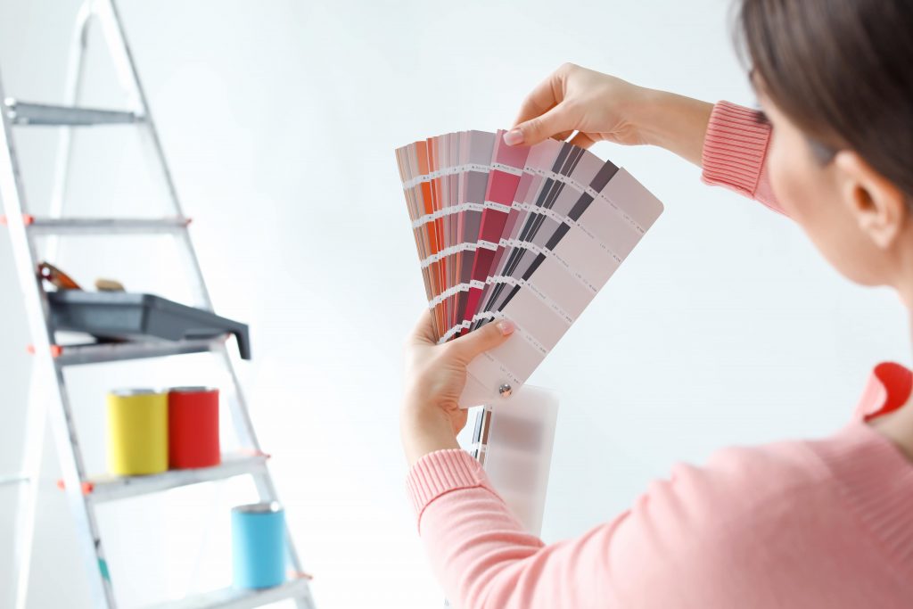
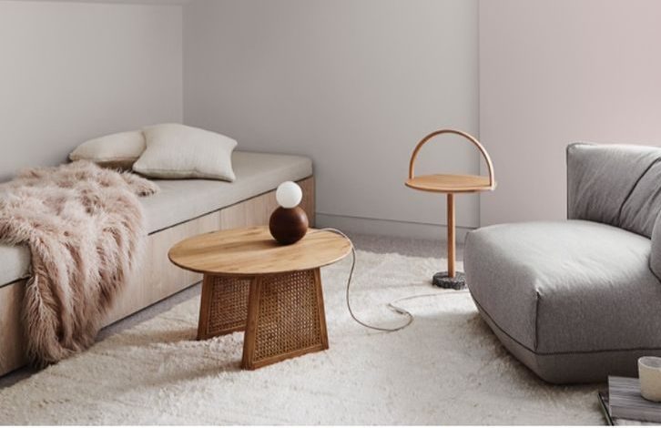
Contrary to popular belief neutral paints extend further than just beiges and whites. In the world of interior design, neutral paint describes a toned-down colour that lacks a high concentration of bright pigments, which instead, is more muted in appearance.
This doesn’t mean neutral paint colours are boring and dull. They have quite the opposite effect actually. Beiges can have pink or yellow undertones to give a warm neutral look, that can make a home feel cosy and warm. Undertones of greys and blues offer a cool soft feel for whites, which gives the room an open and breezy feel perfect for open-plan and beach homes. Neutral paints allow homeowners freedom when choosing decor and furniture, saving them time finding something specific to fit the colour scheme.

Why Go with Neutral Colours?
When considering the right wall colour to use in your home, it’s good to think about how it will complement each room. What is the room used for, and does it have a lot of decorations? Typically a room with a high vibrancy of colour can look striking, yet that narrows the homeowner’s selection of furnishing to suit the room. Matching decor with your wall colours can be quite a challenge and can be hard to make decisions on what to furnish the rooms with.
Neutral tones, on the other hand, can be relatively easy to furnish and match colours with. Have a bold burgundy couch that you’re rather fond of? There’s no reason it couldn’t go with a warm neutral room, with hues of pinks and light browns, like Clay Pipe or even a cool Vivid White.
Perhaps you still want a bold and strong colour in a room, but you’re worried it will be garish and overbearing. That’s fine, even it out with some neutral paint. It’s easy enough to match neutral colours to feature walls too.
Some Great Neutral Paint Colour Combinations
Need some more inspiration for different colour combinations? No problem, let’s list off a few of our favourite combinations. We’ll focus on getting a variety of neutral hues in to help you choose the right paint for your home.
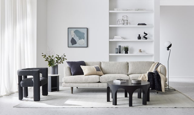
The True Go-With-Anything Look: Vivid White and Antique White U.S.A

Right, so you’re thinking you just need some wall colours that will just go with anything? Vivid White and Antique White U.S.A are great options, for a clean and contemporary look, that won’t distract from any of your interior decorations. Vivid White is the perfect vibrant and clean white for window frames, and borderings to offset the comfortable and warm neutral of Antique White U.S.A.
Refresh Your Interior Spaces: Whisper White and Powdered Gum
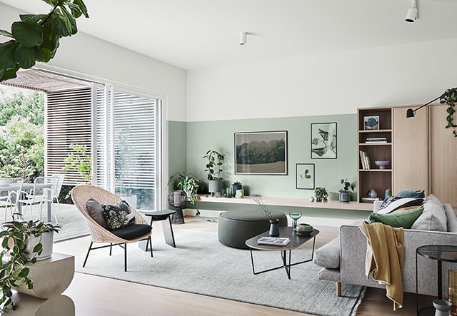
Some interior spaces require a refresh, and that’s where this colour combination comes in. First of Whisper White is a warm white, with an ivory undertone that helps your home feel lush and welcoming. But the real showpiece is the Powdered Gum, an almost natural minty green, with hints of silvers and greys. This combination creates the perfect backdrop for any home wanting a fresh, welcoming and vibrant atmosphere.
Let’s Cool Things Off: Lexicon Quarter and Terrace White
These neutral shades work together to give your home a cool, open and airy feel. Lexicon Quarter and Terrace White are both cooler whites with subtle hues of soft blues and greys. Furnishing an open-plan home with large windows works best with these shades to help the natural light bounce around and accentuate the cool hues. Beach homes and warmer climate houses benefit the most from these colours as they make a home feel cool and livable all year round.
Inviting and Warm: Warm Neutral and White Exchange Half
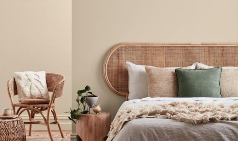
Got an office space, library, or living room that needs some warmth brought into it? These two neutrals are rich, yet refined, hosting hues of brown, red and grey. The brown and red gives depth to any room, whilst the grey tones allow the room to breathe, opening it up.
Subtly Elegant: Hint Of Lavender and Ghost Town Quarter
Both Hint Of Lavender and Ghost Town Quarter have warm hues and undertones of pink and grey. These colours will look inviting with a number of different interior styles, perfect for bedrooms, offices and entertainment rooms. Whilst the almost purple colour is very decadent, it’s toned down and won’t flood the room with colour, giving it a relaxed and calm feel.
Time to Get the Brush Wet
Now you’ve decided which neutral palette might best suit your home, which is great to hear! The only thing left to do is get paint on the wall. Before you get out your old brush, it’s a good idea to consider how you want to get it done. It is possible to paint it yourself, but it can be a tedious and meticulous task. Particularly if you’re using neutral tones and want to get it done properly. This is why it’s best to hire a professional painter and Elite Painting is here for you.
Our team of gifted, professional painters offer the best services in Perth. We specialise in ensuring your paint is going to last as long as possible without the need for any touch-ups for years to come. We use the highest quality paint from Dulux and professional painters with years of experience in the industry. If you’re still feeling stuck on colour choices, not to worry, our team are experts in everything to do with paint and colour. We make it a priority to ensure our clients are happy with their choices of paint.